Product Designer
@Block Renovation
B2B workflowsMarketplace operationsContractor UX
Internal tools
jess.c.mtz@gmail.com
↗
↗
Redesigning contractor work orders for faster job qualification
Snapshot
Role
Led UX, UI, information architecture, stakeholder feedback, and design handoff
Objective
Update contractor work orders to support Studio-generated project assets while improving how contractors evaluate job fit, scope, location, and project value.
Key Contraints
Design and align the improved work order within two weeks, without direct contractor research, while supporting desktop, mobile, Studio, non-Studio, and mixed project variations.
Key Contraints
Shipped a more scannable contractor work order with clearer job qualification details, Studio asset support, onboarding tooltips, and annotated dynamic components for engineering and operations teams.
Case Study
Block Renovation operated as a two-sided marketplace connecting homeowners with vetted contractors. As Studio, our 0→1 renovation planning tool, moved into the core product experience, it changed the type of information Block collected from homeowners. Some clients now came through the marketplace with richer planning assets, including existing space photos, final renders, design intent, materials, and estimated costs. Others still came through the traditional flow with a simpler project brief. The contractor work order needed to support both paths clearly.
The initial ask was to add Studio assets into the existing work order, but I saw a larger opportunity. Contractor-facing teams had already heard recurring feedback that the work order was narrow, scroll-heavy, visually plain, and difficult to scan. Contractors were not reading the work order like a document. They were using it to make a fast qualification decision.
Through feedback from contractor operations and sales teams, I framed the redesign around three questions contractors needed to answer quickly:
- Can I service this location?
- Is the scope of work in my wheelhouse?
- Is this job financially worth my time?
I redesigned the work order from a narrow modal into a more spacious, near full-page desktop experience, with the most important qualification details surfaced upfront. Location, scope, and estimated cost became the primary scan points.
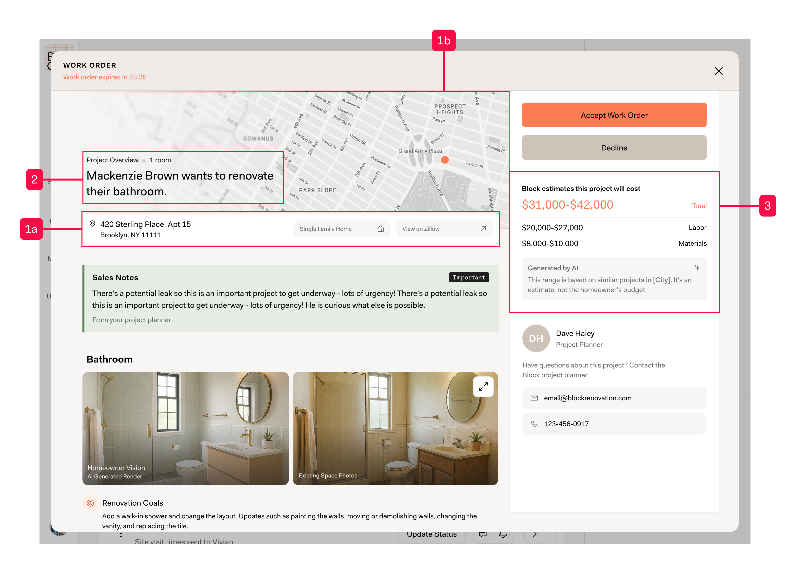
1a. Service address
Shows contractors where the project is before they evaluate the rest of the lead.
1b. Visual context
Gives contractors a quick spatial read of the project location.
2. Scope summary
Summarizes the client’s request for fast scanning, with fuller scope details available below.
3. Estimated budget
Clarifies the client’s expected budget range without presenting it as a contractor quote.
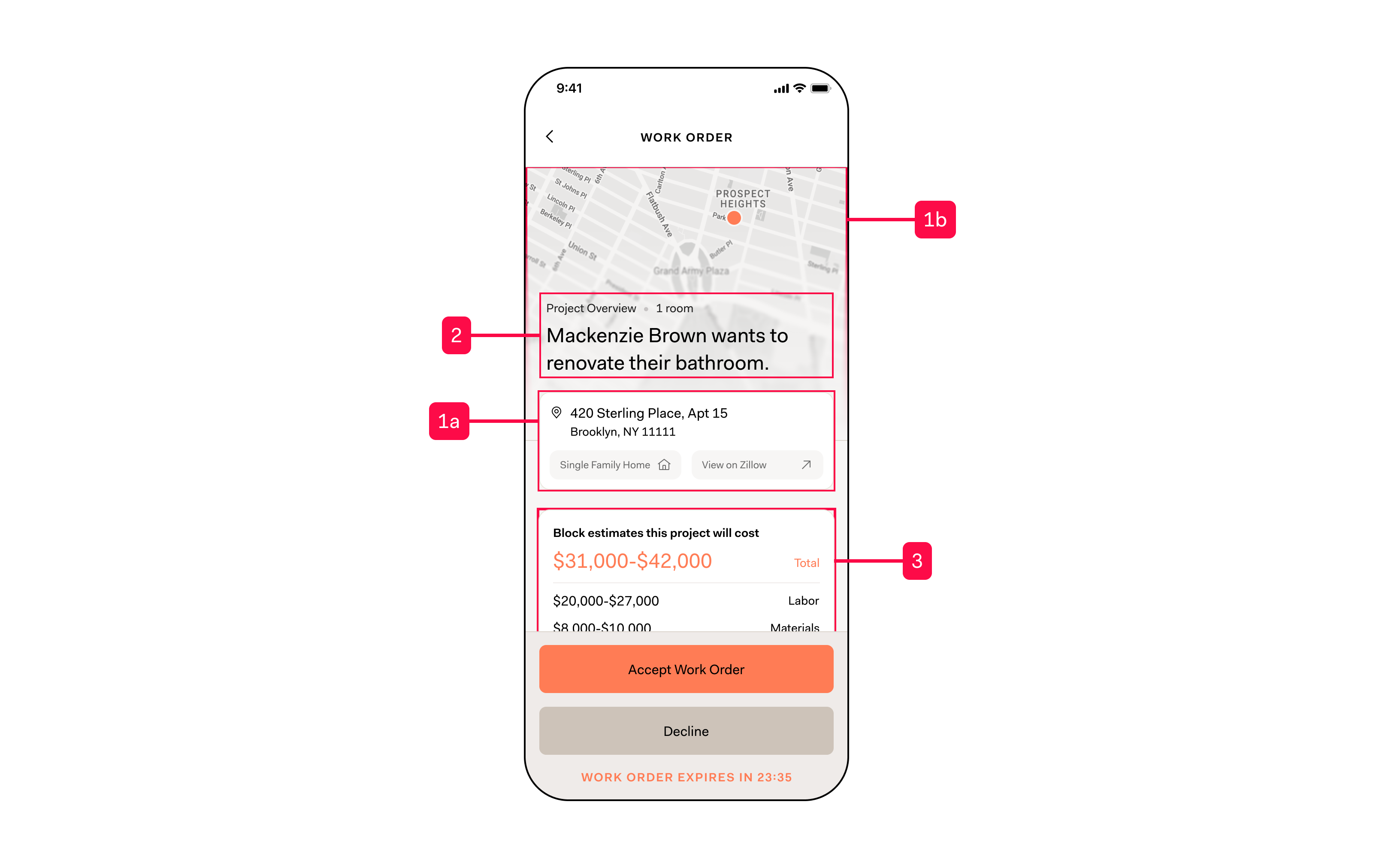
On mobile, where contractors were more likely to be reviewing jobs on the go, I made sure those same details appeared above the fold.
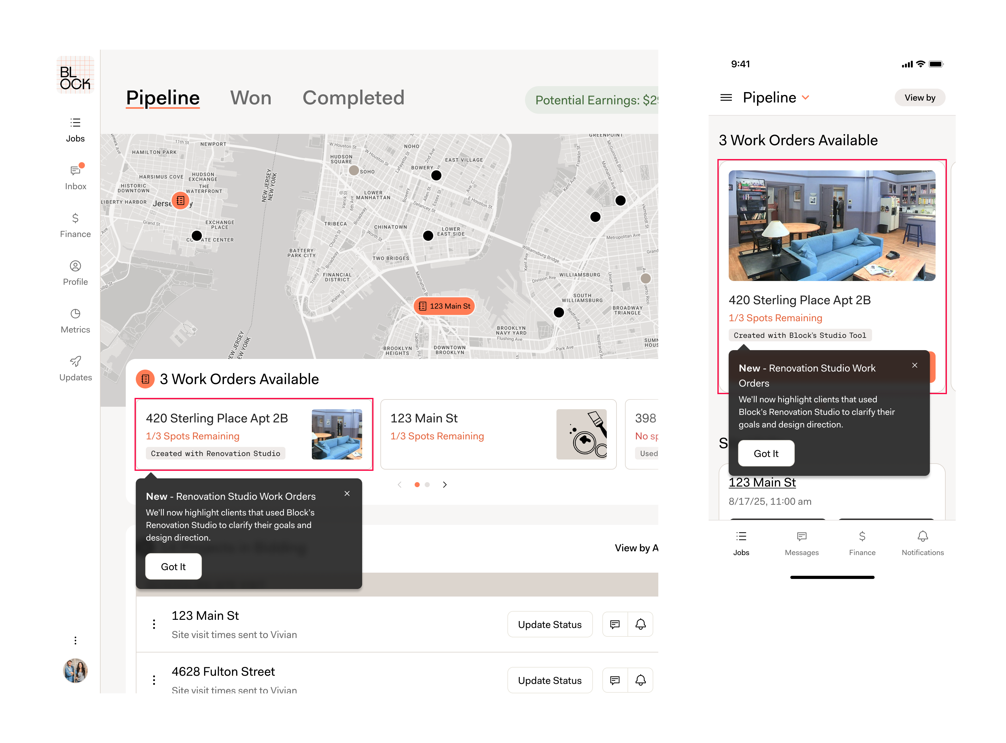
On the jobs pipeline page, I added a Renovation Studio tag and onboarding tooltips so contractors could understand when a client had gone through the new planning experience and what had changed in the work order.
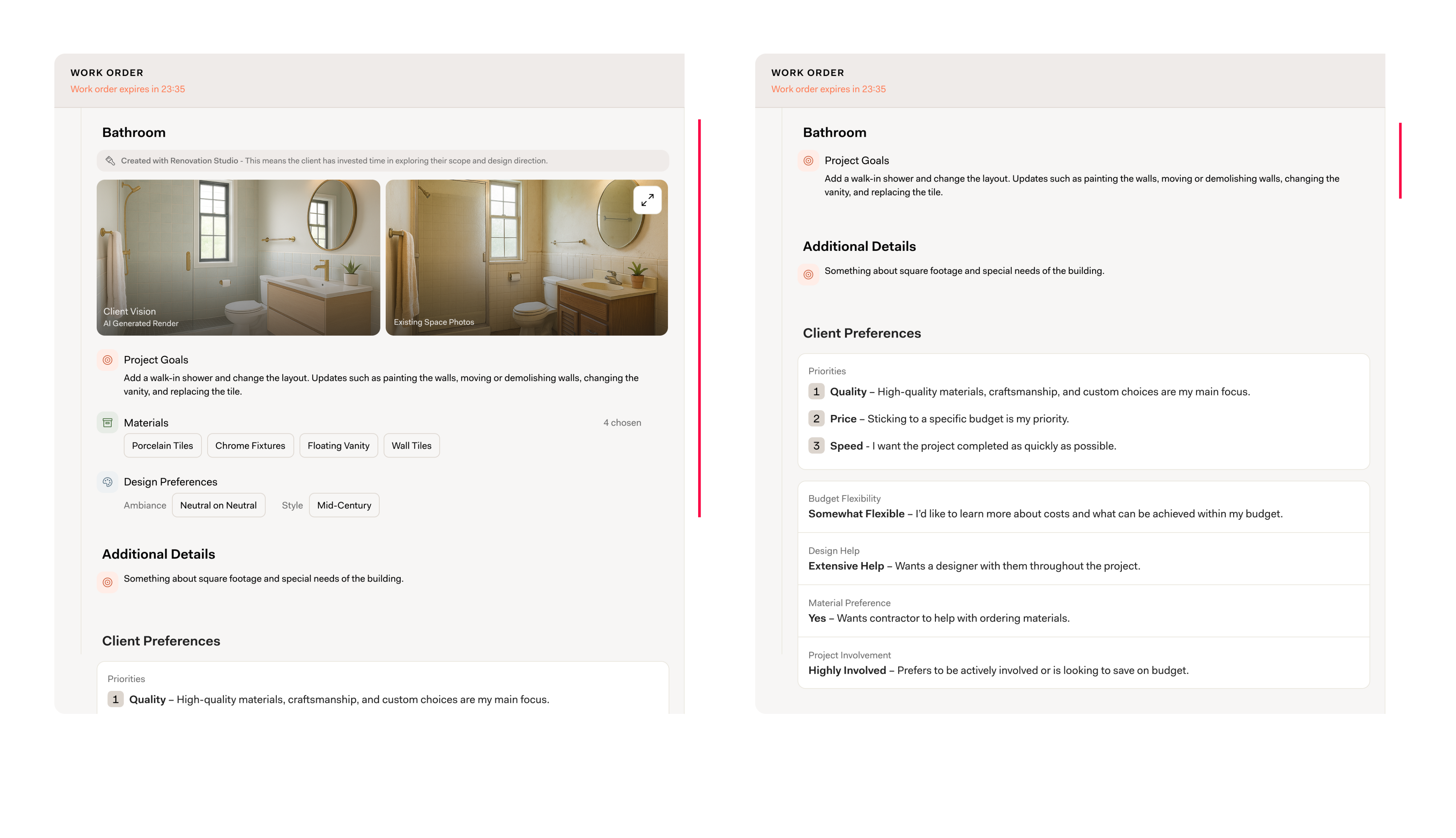
System Logic and Edge Cases → The work order had to flex across several project types: clients with Studio Touch, clients without Studio Touch, and mixed cases where a client used Studio for one space, like a bathroom, but added another non-Studio space, like a basement. I designed dynamic sections that could adapt based on available project data, including variable client names, spaces, maps, photo counts, existing space photos, ideal space imagery, materials, and project planner information. One important clarification was separating the Block project planner from the client, since contractors could not contact the client directly until they accepted the work order.
Annotated Components
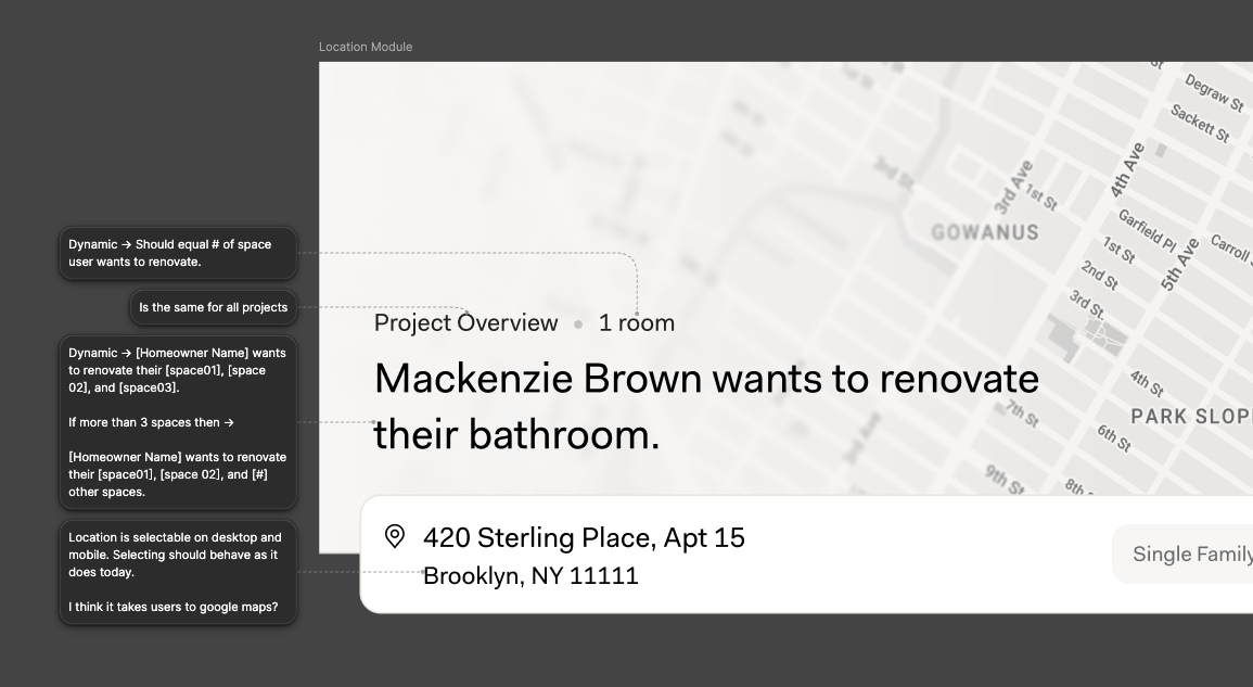
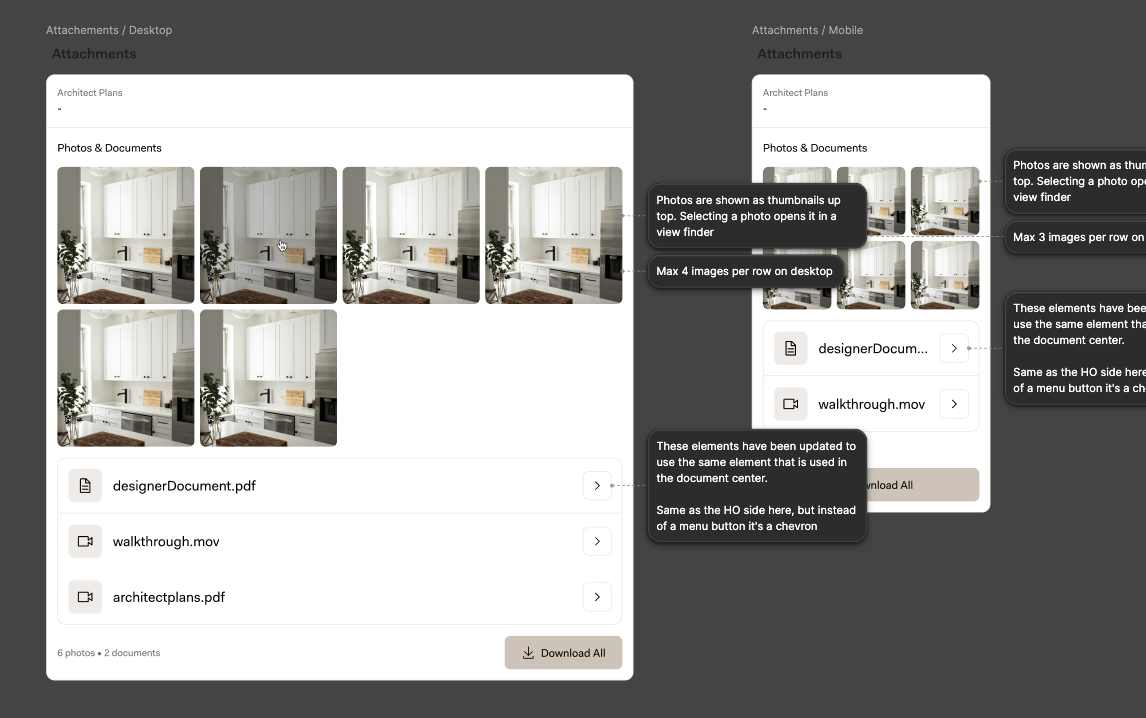
Because this change touched contractor operations, sales, support, and the contractor app experience, the work was highly visible across the company. I created a detailed handoff file with annotated dynamic components, content logic, and state variations so engineering could build efficiently and internal teams could understand what contractors would see. The final design turned a basic project summary into a more useful marketplace handoff: one that helped contractors qualify jobs faster, supported richer Studio-generated assets, and gave internal teams a clearer artifact to explain, troubleshoot, and operationalize.
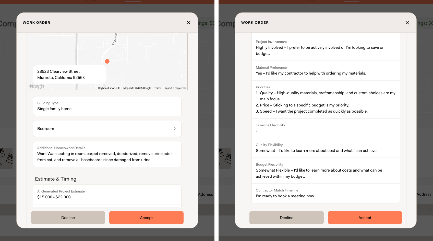
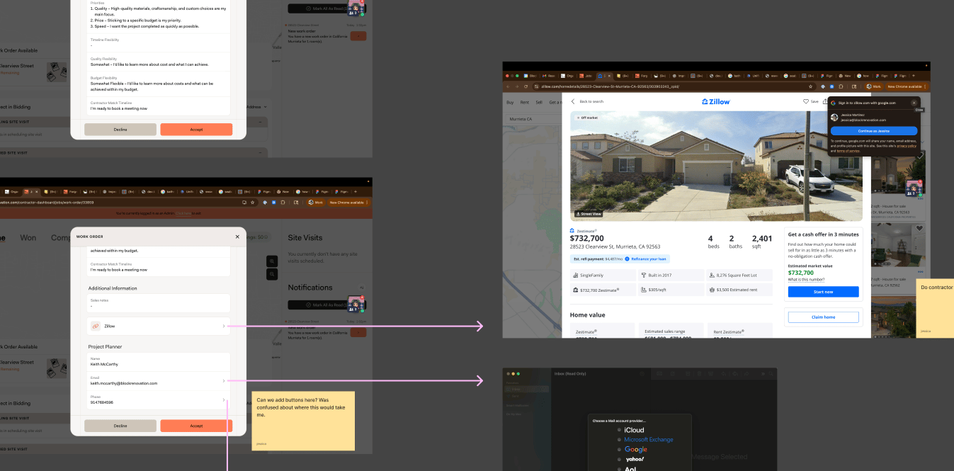
Previous Work Order Audit
More Projects
Designing a visual preference game to capture homeowner taste
Consumer UX | Playful Onboarding
@Block Renovation
↗
Scaling a Beta Experiment into a Core Growth Engine
AI-Powered Renovation Planning
@Block Renovation
↗
Re-Architecting Community Creation for Scalable Web3 Governance
Web3 Governance Infrastructure
@Commonwealth
↗
Designing Operational Infrastructure for Scalable SMA Growth
Finance | Advisor Portal
@Code and Thoery
↗