Jessica Martinez,

Senior Product Designer

Back

Product Designer

@Block Renovation

Interaction designConsumer UXPreference captureOnboarding

jess.c.mtz@gmail.com

Linkedin

Designing a visual preference game to capture homeowner taste

Snapshot

Role

Led research, interaction design, UI design, prototyping, and iteration.

Objective

Help homeowners identify and communicate their design preferences during onboarding, especially when they lacked the language to describe what they wanted.

Key Contraints

Design a useful preference capture flow that felt fun and low-friction enough to support acquisition, not hurt onboarding completion.

Key Contraints

User testing showed strong positive feedback on the interaction model and results, while event tracking showed a high completion rate.

Case Study
Context → Many homeowners come to Block knowing they want to renovate, but not knowing how to describe the design direction they want. Some users arrived with Pinterest boards, specific material references, or a clear aesthetic. Others simply knew that their space felt outdated and needed help translating vague taste into actionable design language.

Through research, we saw an opportunity to make onboarding feel less like a form and more like a guided discovery experience. The goal was to help homeowners identify their preferences while giving Block more structured inputs to personalize the next step of the Studio experience.
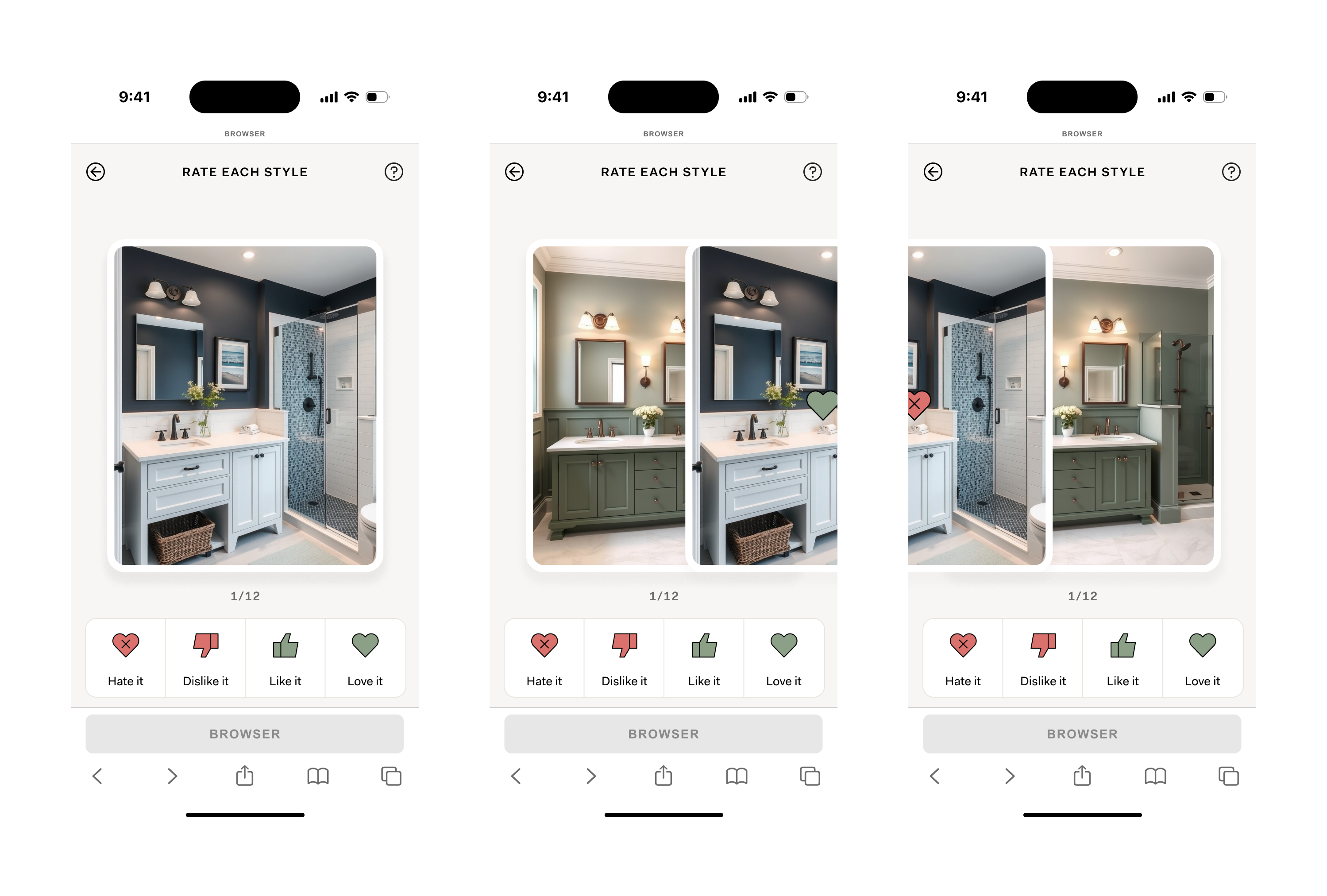
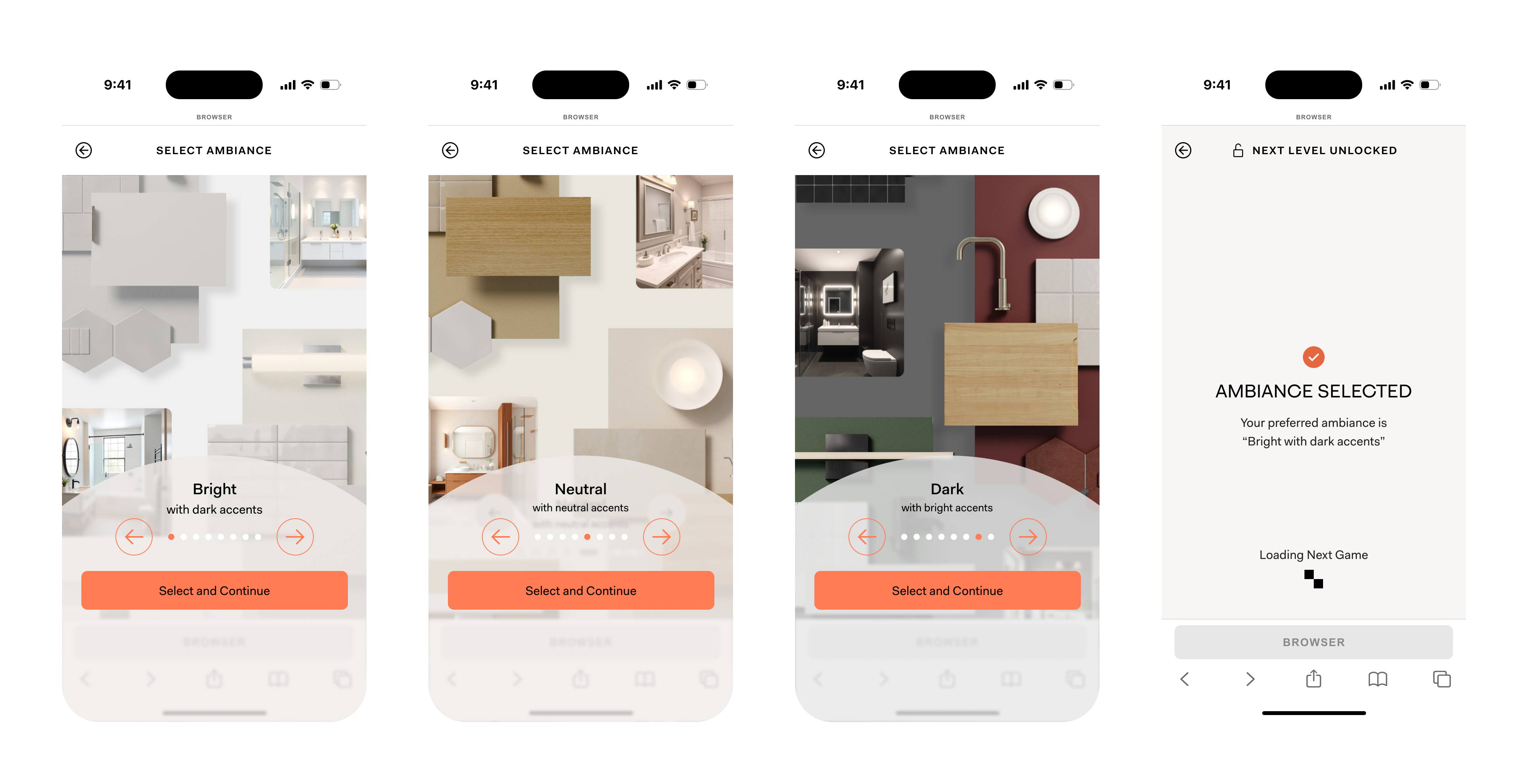
The Concept → I designed a visual preference game that helped homeowners discover their style through fast, image-based decisions. The experience started with ambiance, a simplified way to understand the overall mood and color direction of a space. From there, users reviewed bathroom images within their selected ambiance and reacted to each one through a swipe-like interaction.

Instead of forcing a binary yes or no, the game gave users four choices: love, like, dislike, or hate. This gave us more nuance because homeowners often liked parts of a space without liking the entire design. The interaction kept the experience lightweight, while the response model gave us richer signals about their taste.

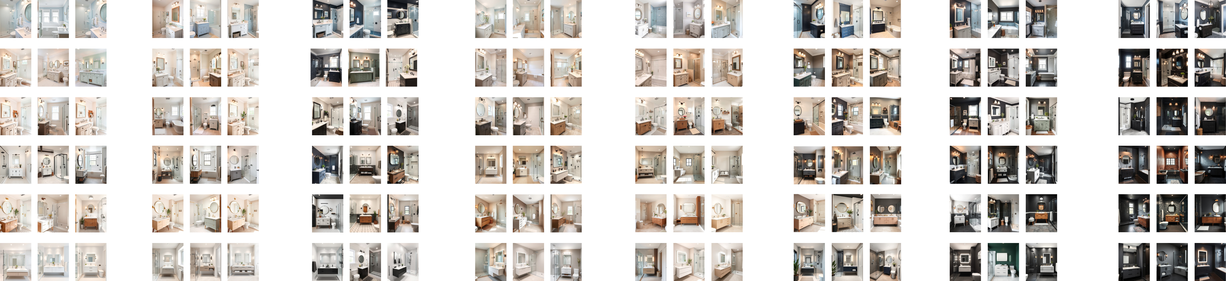
Designing The System → The first iteration focused on bathrooms and required a large visual asset system. We designed around eight ambiance options and six styles, with multiple images needed across each ambiance and style combination. This created a content and design challenge: the game needed enough variety to feel accurate, but not so much that it became exhausting.

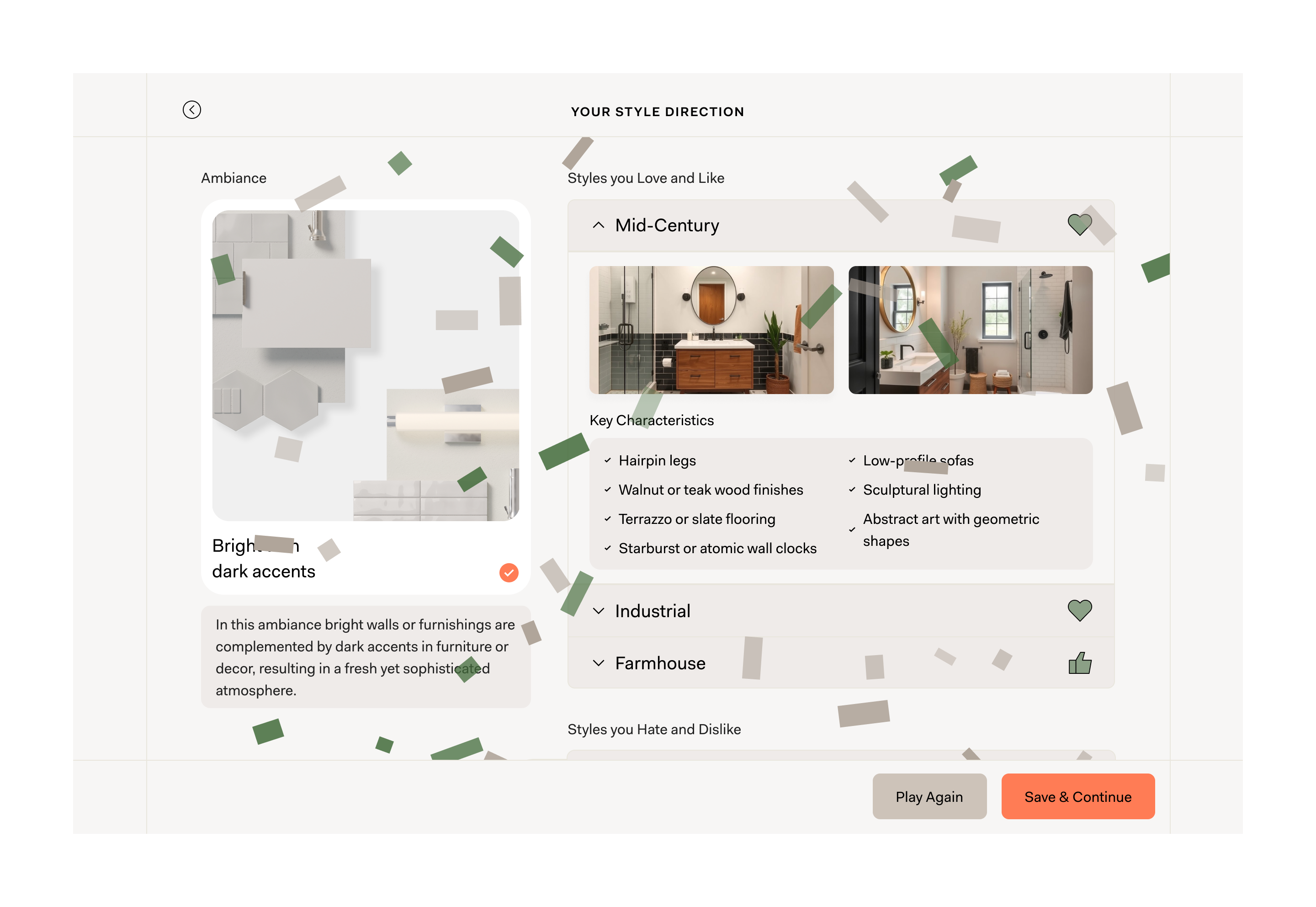
At the end of the flow, users received style results with key characteristics. For example, someone who matched with mid-century style might see guidance around walnut or teak finishes, terrazzo or slate flooring, and hairpin legs. These details helped users connect what they visually liked to the words, materials, and design references they could use later with a designer, contractor, or retailer.
Research and Iteration → I led two rounds of user research to understand whether the game felt useful, accurate, and worth completing. Feedback was strongly positive, especially around the interaction model and the results. Users liked that the experience felt more playful than a standard intake form, and many described the results as clarifying something they already felt but did not know how to name.

The most useful feedback came from users who said the key characteristics gave them new language. They could now search for materials, describe preferences in a store, or talk to a contractor with more confidence. That validated the core hypothesis: the game was not just collecting taste data for Block, it was helping homeowners understand their own preferences.
The Outcome → The style game became a successful part of the Studio onboarding experience. Event tracking showed a high completion rate, which helped validate that the flow did not feel too long or burdensome. In interviews, some users even wanted more of it.

For me, this project was a chance to bring more interaction design and UI craft into a conversion-focused product. It showed that onboarding can still be useful, structured, and business-critical while feeling playful, visual, and genuinely helpful to the user.

More Projects

Scaling a Beta Experiment into a Core Growth Engine

AI-Powered Renovation Planning

@Block Renovation

Redesigning contractor work orders for faster job qualification

Marketplace Operations | B2B

@Block Renovation

Re-Architecting Community Creation for Scalable Web3 Governance

Web3 Governance Infrastructure

@Commonwealth

Designing Operational Infrastructure for Scalable SMA Growth

Finance | Advisor Portal

@Code and Thoery

Jessica Martinez,

Senior Product Designer

Back

Product Designer

@Block Renovation

Interaction designConsumer UXPreference captureOnboarding

jess.c.mtz@gmail.com

Linkedin

Designing a visual preference game to capture homeowner taste

Snapshot

Role

Led research, interaction design, UI design, prototyping, and iteration.

Objective

Help homeowners identify and communicate their design preferences during onboarding, especially when they lacked the language to describe what they wanted.

Key Contraints

Design a useful preference capture flow that felt fun and low-friction enough to support acquisition, not hurt onboarding completion.

Key Contraints

User testing showed strong positive feedback on the interaction model and results, while event tracking showed a high completion rate.

Case Study

Context → Many homeowners come to Block knowing they want to renovate, but not knowing how to describe the design direction they want. Some users arrived with Pinterest boards, specific material references, or a clear aesthetic. Others simply knew that their space felt outdated and needed help translating vague taste into actionable design language.

Through research, we saw an opportunity to make onboarding feel less like a form and more like a guided discovery experience. The goal was to help homeowners identify their preferences while giving Block more structured inputs to personalize the next step of the Studio experience.

The Concept → I designed a visual preference game that helped homeowners discover their style through fast, image-based decisions. The experience started with ambiance, a simplified way to understand the overall mood and color direction of a space. From there, users reviewed bathroom images within their selected ambiance and reacted to each one through a swipe-like interaction.

Instead of forcing a binary yes or no, the game gave users four choices: love, like, dislike, or hate. This gave us more nuance because homeowners often liked parts of a space without liking the entire design. The interaction kept the experience lightweight, while the response model gave us richer signals about their taste.

Designing The System → The first iteration focused on bathrooms and required a large visual asset system. We designed around eight ambiance options and six styles, with multiple images needed across each ambiance and style combination. This created a content and design challenge: the game needed enough variety to feel accurate, but not so much that it became exhausting.

At the end of the flow, users received style results with key characteristics. For example, someone who matched with mid-century style might see guidance around walnut or teak finishes, terrazzo or slate flooring, and hairpin legs. These details helped users connect what they visually liked to the words, materials, and design references they could use later with a designer, contractor, or retailer.

Research and Iteration → I led two rounds of user research to understand whether the game felt useful, accurate, and worth completing. Feedback was strongly positive, especially around the interaction model and the results. Users liked that the experience felt more playful than a standard intake form, and many described the results as clarifying something they already felt but did not know how to name.

The most useful feedback came from users who said the key characteristics gave them new language. They could now search for materials, describe preferences in a store, or talk to a contractor with more confidence. That validated the core hypothesis: the game was not just collecting taste data for Block, it was helping homeowners understand their own preferences.

The Outcome → The style game became a successful part of the Studio onboarding experience. Event tracking showed a high completion rate, which helped validate that the flow did not feel too long or burdensome. In interviews, some users even wanted more of it.

For me, this project was a chance to bring more interaction design and UI craft into a conversion-focused product. It showed that onboarding can still be useful, structured, and business-critical while feeling playful, visual, and genuinely helpful to the user.

More Projects

Scaling a Beta Experiment into a Core Growth Engine

AI-Powered Renovation Planning

@Block Renovation

Redesigning contractor work orders for faster job qualification

Marketplace Operations | B2B

@Block Renovation

Re-Architecting Community Creation for Scalable Web3 Governance

Web3 Governance Infrastructure

@Commonwealth

Designing Operational Infrastructure for Scalable SMA Growth

Finance | Advisor Portal

@Code and Thoery

Jessica Martinez,

Senior Product Designer

Back

Product Designer

@Block Renovation

Interaction designConsumer UXPreference captureOnboarding

jess.c.mtz@gmail.com

Linkedin

Designing a visual preference game to capture homeowner taste

Snapshot

Role

Led research, interaction design, UI design, prototyping, and iteration.

Objective

Help homeowners identify and communicate their design preferences during onboarding, especially when they lacked the language to describe what they wanted.

Key Constraints

Design a useful preference capture flow that felt fun and low-friction enough to support acquisition, not hurt onboarding completion.

Outcomes

User testing showed strong positive feedback on the interaction model and results, while event tracking showed a high completion rate.

Case Study

Context → Many homeowners come to Block knowing they want to renovate, but not knowing how to describe the design direction they want. Some users arrived with Pinterest boards, specific material references, or a clear aesthetic. Others simply knew that their space felt outdated and needed help translating vague taste into actionable design language.

Through research, we saw an opportunity to make onboarding feel less like a form and more like a guided discovery experience. The goal was to help homeowners identify their preferences while giving Block more structured inputs to personalize the next step of the Studio experience.

The Concept → I designed a visual preference game that helped homeowners discover their style through fast, image-based decisions. The experience started with ambiance, a simplified way to understand the overall mood and color direction of a space. From there, users reviewed bathroom images within their selected ambiance and reacted to each one through a swipe-like interaction.

Instead of forcing a binary yes or no, the game gave users four choices: love, like, dislike, or hate. This gave us more nuance because homeowners often liked parts of a space without liking the entire design. The interaction kept the experience lightweight, while the response model gave us richer signals about their taste.

Designing The System → The first iteration focused on bathrooms and required a large visual asset system. We designed around eight ambiance options and six styles, with multiple images needed across each ambiance and style combination. This created a content and design challenge: the game needed enough variety to feel accurate, but not so much that it became exhausting.

At the end of the flow, users received style results with key characteristics. For example, someone who matched with mid-century style might see guidance around walnut or teak finishes, terrazzo or slate flooring, and hairpin legs. These details helped users connect what they visually liked to the words, materials, and design references they could use later with a designer, contractor, or retailer.

Research and Iteration → I led two rounds of user research to understand whether the game felt useful, accurate, and worth completing. Feedback was strongly positive, especially around the interaction model and the results. Users liked that the experience felt more playful than a standard intake form, and many described the results as clarifying something they already felt but did not know how to name.

The most useful feedback came from users who said the key characteristics gave them new language. They could now search for materials, describe preferences in a store, or talk to a contractor with more confidence. That validated the core hypothesis: the game was not just collecting taste data for Block, it was helping homeowners understand their own preferences.

The Outcome → The style game became a successful part of the Studio onboarding experience. Event tracking showed a high completion rate, which helped validate that the flow did not feel too long or burdensome. In interviews, some users even wanted more of it.

For me, this project was a chance to bring more interaction design and UI craft into a conversion-focused product. It showed that onboarding can still be useful, structured, and business-critical while feeling playful, visual, and genuinely helpful to the user.

More Projects

Scaling a Beta Experiment into a Core Growth Engine

AI-Powered Renovation Planning

@Block Renovation

Redesigning contractor work orders for faster job qualification

Marketplace Operations | B2B

@Block Renovation

Re-Architecting Community Creation for Scalable Web3 Governance

Web3 Governance Infrastructure

@Commonwealth

Designing Operational Infrastructure for Scalable SMA Growth

Finance | Advisor Portal

@Code and Thoery